4 min read

Building the ParkSmart DSL

Building the ParkSmart DSL

Reduced dev clarifications by 65%, reused components 80% of the time, and shipped weeks faster

Reduced dev clarifications by 65%, reused components 80% of the time, and shipped weeks faster

1. Introduction

“Give me six hours to chop down a tree and I will spend the first four sharpening the axe.” — Abraham Lincoln

“Give me six hours to chop down a tree and I will spend the first four sharpening the axe.” — Abraham Lincoln

This project was about building a complete design system from scratch for the ParkSmart dashboard — from auditing existing screens to setting up components, tokens, and documentation

This project was about building a complete design system from scratch for the ParkSmart dashboard — from auditing existing screens to setting up components, tokens, and documentation

Company

Company

ParkSmart

ParkSmart

Type

Type

Design System

Design System

Platform

Platform

Web Application

Web Application

2.
Audit & preparation

Before creating the DSL, I conducted a detailed audit of the existing ParkSmart dashboard to identify major inconsistencies and inefficiencies. This process revealed several pain points that needed to be addressed:

Before creating the DSL, I conducted a detailed audit of the existing ParkSmart dashboard to identify major inconsistencies and inefficiencies. This process revealed several pain points that needed to be addressed:

Audit & Research
Audit & Research

Audit & Research

Current Dashboard
Current Dashboard

Current Dashboard

We set out to revamp the ParkSmart dashboard — clean it up, make it usable, give it the love it desperately needed. But pretty quickly, it became clear: we couldn’t fix the UI without first fixing what it was built on. There was no real system in place. Just scattered components, inconsistent patterns, and a lot of guesswork.

We set out to revamp the ParkSmart dashboard — clean it up, make it usable, give it the love it desperately needed. But pretty quickly, it became clear: we couldn’t fix the UI without first fixing what it was built on. There was no real system in place. Just scattered components, inconsistent patterns, and a lot of guesswork.

1.1 Findings

Atoms are the foundational design tokens — colors, typography, icons, and spacing

Inconsistencies Across the UI

Different button styles used across various screens (some with sharp corners, some rounded, different shadow effects).

Inconsistencies Across the UI

Different button styles used across various screens (some with sharp corners, some rounded, different shadow effects).

Inconsistencies Across the UI

Find your English level in just 2 minutes — no pressure, just a starting point.

Lack of Reusable Components

Developers often rebuilt components manually, leading to unnecessary variations and inefficiencies.

Lack of Reusable Components

Developers often rebuilt components manually, leading to unnecessary variations and inefficiencies.

Lack of Reusable Components

Developers often rebuilt components manually, leading to unnecessary variations and inefficiencies.

Scalability & Maintainability Issues

Every new feature added more complexity instead of seamlessly integrating into a structured system

Scalability & Maintainability Issues

Every new feature added more complexity instead of seamlessly integrating into a structured system

Scalability & Maintainability Issues

Every new feature added more complexity instead of seamlessly integrating into a structured system

Outdated React Library

We were using React 17, which lacked support for modern features, making it hard to adopt new design components and guide developers effectively.

Outdated React Library

We were using React 17, which lacked support for modern features, making it hard to adopt new design components and guide developers effectively.

Outdated React Library

We were using React 17, which lacked support for modern features, making it hard to adopt new design components and guide developers effectively.

01

01

01

02

02

02

03

03

03

04

04

04

05

05

05

06

06

06

1.2 Benchmark

Learning from the best before building our own

Before building the system, I looked at how the pros do it. I studied design systems like Shopify Polaris and Atlassian’s ADG, focusing on how they structure components, document usage, and scale across products.

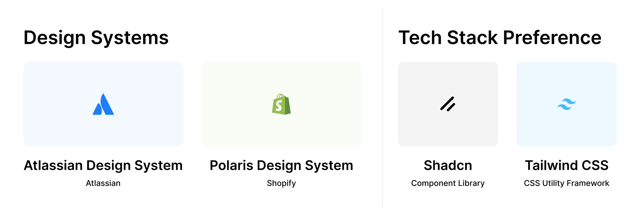
To bring the design system to life, I aligned early with the dev stakeholders and finalized a tech stack we all felt confident about. Shadcn gave us a flexible headless component library, and Tailwind CSS offered utility-first styling that matched our speed and scalability needs. Together, they helped us build fast without sacrificing structure

3. Design

3. Design

The Atomic Design methodology

To ensure consistency, scalability, and clarity in component design, I followed the Atomic Design Principle by Brad Frost. This methodology breaks down interfaces into a hierarchy of reusable parts — starting from the smallest elements and building up to fully composed pages

To ensure consistency, scalability, and clarity in component design, I followed the Atomic Design Principle by Brad Frost. This methodology breaks down interfaces into a hierarchy of reusable parts — starting from the smallest elements and building up to fully composed pages

Atoms

Molecules

Organisms

Templates

Pages

Atoms

Molecules

Organisms

Templates

Pages

Atoms

Molecules

Organisms

Templates

Pages

Atoms

Atoms are the foundational design tokens — colors, typography, icons, and spacing

Molecules

Molecules combine atoms into functional UI elements like input fields, badges, parking selector, etc

Organisms

Organisms are larger structures like dashboard sections, tables, side nav bar, navigation & etc

Templates

Templates define layout and structure without real data.

Pages

Pages are complete, real-world screens using actual content and configuration.

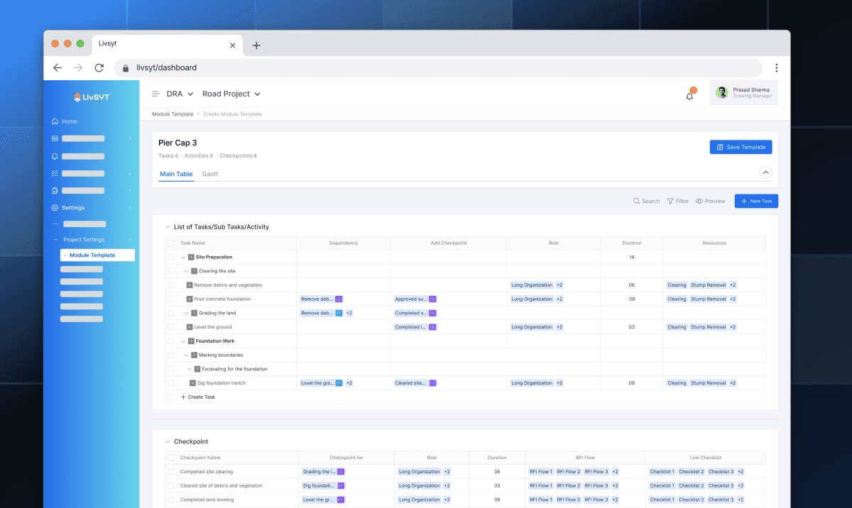
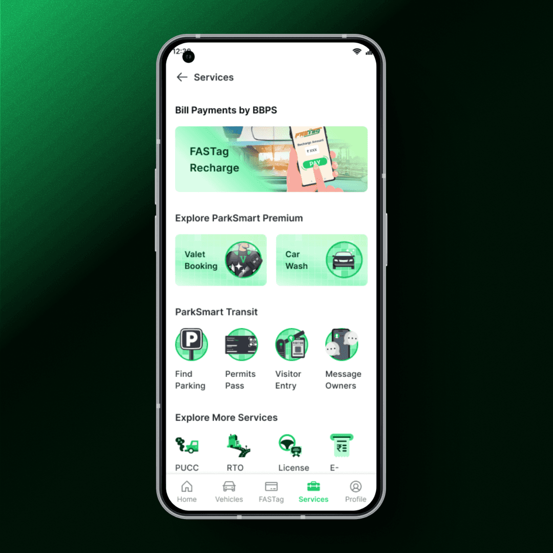
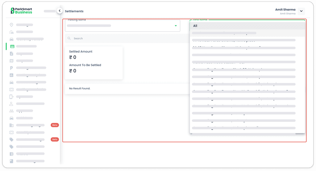
You’ve already seen the templates and components — the building blocks. Unfortunately, I can’t show every page or flow due to NDA restrictions (believe me, I’d love to).

What I can say is that those components weren’t just design tokens collecting dust — they were used to bring structure, consistency, and sanity across the product. The pages now follow a system, not a guess. Layouts are cohesive, spacing actually means something, and UI decisions are no longer based on vibes.

4. Conclusion

4. Conclusion

You don’t ‘finish’ a design system. You evolve it. It’s not about building fast — it’s about building right, backed by research, logic, and a team that actually uses it

DSL Impact (Besides Just Buttons)

Clearer dev direction, 65% less back-and-forth

No more design detective work — padding, alignment, and spacing came built-in

Clearer dev direction, 65% less back-and-forth

No more design detective work — padding, alignment, and spacing came built-in

Clearer dev direction, 65% less back-and-forth

No more design detective work — padding, alignment, and spacing came built-in

90% cleaner handoffs = fewer QA hiccups

Shared tokens meant fewer surprises in staging. What was designed got built

90% cleaner handoffs = fewer QA hiccups

Shared tokens meant fewer surprises in staging. What was designed got built

90% cleaner handoffs = fewer QA hiccups

Shared tokens meant fewer surprises in staging. What was designed got built

80% component reuse

From dashboards to modals — teams started assembling, not reinventing

80% component reuse

From dashboards to modals — teams started assembling, not reinventing

80% component reuse

From dashboards to modals — teams started assembling, not reinventing

50–60% faster shipping

Less time styling from scratch. More time building what matters

50–60% faster shipping

Less time styling from scratch. More time building what matters

50–60% faster shipping

Less time styling from scratch. More time building what matters

What I learned (or re-learned) is that a DSL isn’t something you hack together in a few weeks. It takes time. It takes research. And most importantly, it needs buy-in. Because you’re not just designing components — you’re designing how teams work together

What I learned (or re-learned) is that a DSL isn’t something you hack together in a few weeks. It takes time. It takes research. And most importantly, it needs buy-in. Because you’re not just designing components — you’re designing how teams work together

Open to Work

Amit Sharma

❤️ I design with intent, ship with care

Made with ❤️, 100% laziness, and just the right amount of last-minute panic.

Open to Work

Amit Sharma

❤️ I design with intent, ship with care

Made with ❤️, 100% laziness, and just the right amount of last-minute panic.

Open to Work

Amit Sharma

❤️ I design with intent, ship with care

Made with ❤️, 100% laziness, and just the right amount of last-minute panic.